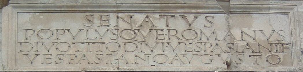
Did you know that many of today’s fonts actually have a common origin? This is capitalis monumentalis – the father of fonts. It is the first serif font, and serifs are those small dashes that we see at the base of the letters and that guide our eyes along the horizontal line.
Capitalis Monumentalis history
The history of the font begins with the oldest script in Latin and is called the “capital letter” or “capital font”. Inscriptions in this font were created on papyrus, stone, parchment codex, wax boards, and very rarely on metal.
Capitalis monumentalis is most commonly used in architecture and murals. You can see it on most slabs, remains, columns, temples, and other archaeological finds. Serif, aligned and readable from a great distance. The best example of the use of this font is the inscription on Trajan’s Column in Rome from 114.
Serif and sans serif font saga
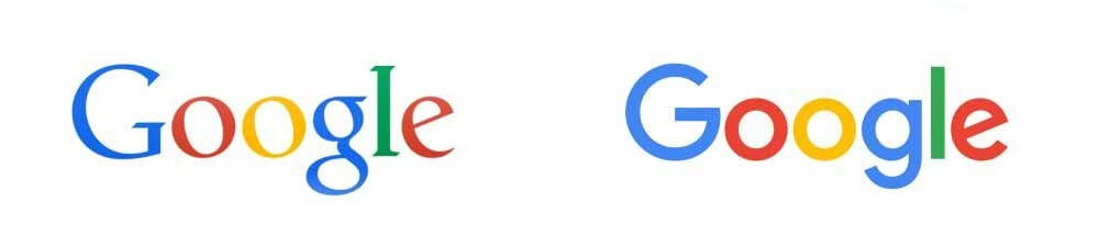
In 2015, the largest online search engine Google redesigned its logo – one of the most recognizable on the planet, to achieve a cleaner and more effective advertising design. Its designers chose to switch from a font with a serif to one without. This change concerns an argument for aesthetics that has separated typographers for more than 200 years.
In design circles, the word “serif” itself causes controversy. Some historians claim that the word comes from the Dutch “schreef” (pen characters). Others wonder if “serif” can be etymologically related to the Urdu word “sharif”, which means “cultivated and refined”.
In calligraphy, the art of hand-painted letters, serifs serve two purposes. They help the writer gain control over the impulse to mark, the pressure, and the angles of displacement of the shoulder to form curves and change the thickness of the strokes.
Over time, through practice and refinement, what was once a mechanical necessity has become an expressive ornamentation that has made writing look individualistic and complex. When carved in stone, serifs allow words to appear aligned. It is a common claim that the outlines of Roman letters are first painted on the stone, and then the stone carvers follow the traces of the brushes. And the serifs themselves are created by the detection when carving the given letter. Victorians therefore used serifs in all their fonts and they were common in Italian Renaissance architecture. They were perceived as “Roman”. Today, the names of computerized fonts (Times New Roman, Comic Sans, etc.) and the form of the letters themselves cover the history of human civilization.
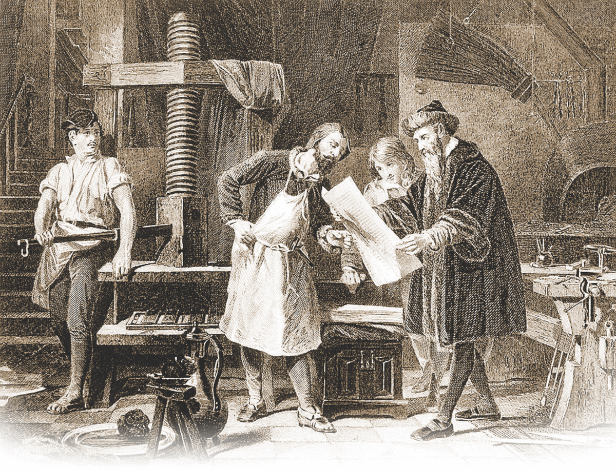
In Gutenberg‘s time (1450 and beyond), as paradoxical as it may sound, the printed text was made to look like it was written by hand. The press was perceived as something sinister – a frightening and impersonal new technology. Intellectuals were skeptical of the new machine of the age. William Blake asked, “And is Jerusalem built here?” Among these dark satanic mills?
It didn’t help that the typographers were small groups of Masonic men who worked late into the night, developing carefully kept trade secrets with ink and metal in unpleasant-smelling foundries. The set of text uses a mirror image: the letters are made backward and look meaningless, but once applied on paper, the result is completely legible text.
At that time, all fonts for commercial and advertising use were decorated with serifs.
Why is there a font with the grotesque name Grotesque?
The first set of sans-serif mechanical fonts was inspired by the discovery and translation of the Rosetta Stone. When Napoleon invaded Egypt in the early 19th century, he brought with him a cohort of academics and cultural experts. Together, they looted and collected many historical artifacts, including the Rosetta Stone. After that, the first sans-serif fonts became a growing cultural craze for everything Egyptian. They were perceived as an echo by the Ancients.
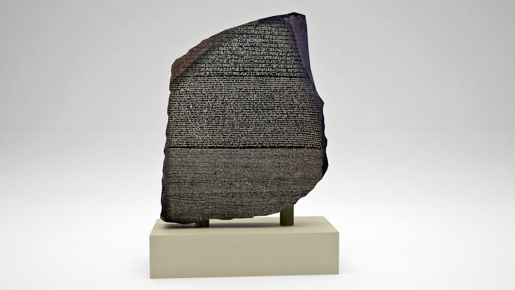
The Rosetta Stone is an epigraphic monument found in 1799 during excavations of the ancient fortress of Al-Rashid, about 7 km from the small town of Rosetta near the Nile. Three versions of a decree issued in Memphis in 196 BC are inscribed on it.
The above and middle texts are written in ancient Egyptian, using hieroglyphs and demotic writing. The text below is in ancient Greek. As the decree contains minimal differences between the three languages, the Rosetta Stone proved to be the key to deciphering Egyptian hieroglyphs.
However, these fonts offended the elites. To them, unsealed letters seemed “naked” and uncivilized. The fonts were called “grotesque” and became known as Gothic. (This should not be confused with Blackletter fonts, the original thick black, heavily embellished letters that are considered Gothic until serifs appear – the definitions of “Gothic” have obviously changed over time.)
These initial serifs. fonts emerged during the Romantic era, a cultural moment that avoided the Church and industrialization. Curiously, the serifs were liked by two different poles of society at the time: bohemians and industrialists.
Because these fonts were devoid of all medieval claims, but were also similar to the writing systems developed by architects, industrialists, and shipbuilders in mechanical plans and drawings, they were far more flexible than serifs. Serif fonts don’t die easily. Until 1896, their return was organized with the Art Nouveau movement. The movement infuriated the typographer Adolf Loos so much that in 1908 he wrote an essay entitled “Ornament and Crime,” in which he stated that “the evolution of culture goes with the removal of ornament from useful objects.” For Loos, as Heller and Anderson point out in their book on New Ornamental Type, the unnecessary decoration is not just a waste of the designer’s time – it is downright immoral.
The Return of Serif Fonts
Despite warnings, serifs made another return decades later – this time to pre-Depression America, through the arts and crafts movement. William Morris, a British textile designer, had a new idea against the rigors of industrialization: He combined modern printing methods with traditional art. Serifs played a key role in the sense of traditionalism he was trying to invoke.
The Bauhaus movement retains some decorative elements as a way to avoid definitions and stereotypes, rejecting ornamentation as a relic. Modernism is born and it depends on the belief that minimalism allows the purest communication. Slowly, the memory of the connection between the calligrapher’s wrist and the typographer’s lead began to fade.
The post-war movements of World War II sought, like the Romantics before them, to emphasize the stupidity of the elites. What once seemed adorned, and the very definition of “civilized,” returning to the great Roman Empire, was now seen as filthy and messy. The designers sought to distance themselves from the aggression and destruction of European imperialism, which was embodied in the serif. “Cleaning” was a way to clear up the mistakes in history.
However, this movement was initially limited to posters and public signs. Technologically, the pen was replaced by a typewriter. Relying on fonts such as Courier, most typewriters in the early-mid-20th century had serifs.
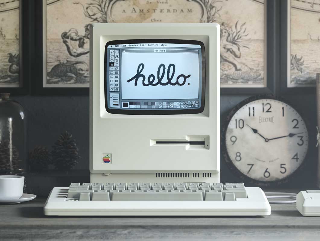
Then, within a few decades, came the computer – and a man named Steve Jobs. As a student, Jobs noticed that the posters at his college were beautifully painted. When questioned, he discovered that the inscriptions came from calligraphy classes offered on campus. He decided to study calligraphy, which eventually led to “fonts” for Apple’s word processing software. In 1984, Steve Jobs made a key move at the time. He puts Helvetica in the Macintosh. If Apple didn’t use it, Helvetica would remain a designer’s preference, just like Times New Roman. Instead, it has become the standard for sans-serif fonts and is becoming increasingly popular with all designers. Nowadays, speaking of the types of digital marketing in terms of display advertising, it cannot go unnoticed that Helvetica is still widely used.
Titan Times New Roman – where does his name come from?
Times New Roman is a serif font. It was commissioned by the British newspaper The Times in 1931. and was invented by Stanley Morrison, an artistic adviser to the British branch of the printing equipment company Monotype, in collaboration with Victor Lardent, an artist of inscriptions in the advertising department of The Times. Times New Roman has also become one of the most popular fonts of all time and is installed on most desktops.
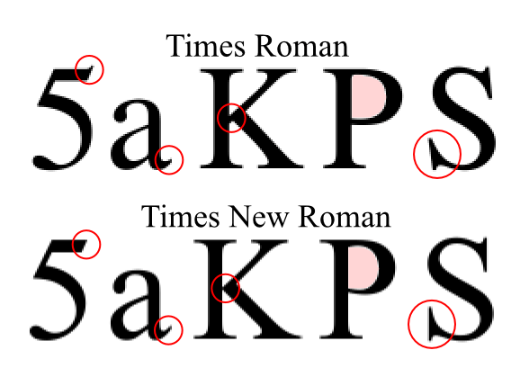
It all started when Morrison recommended to The Times to change the font from a modern to a more solid one, reminiscent of the traditions of the press in the eighteenth century and before. His proposal was to use an older monotype font called Plantin as a basis for the design. (Times New Roman most often matches Plantin’s size.) The main change was that the contrast between the strokes was improved to get a clearer image. The new design debuted in The Times on October 3, 1932. A year later, the design was released for commercial sale.
The name Times New Roman, Roman is a reference to the ordinary or Roman style (sometimes also called Antiqua), the first part of the Times New Roman family to be designed. The Roman type has its roots in the Italian press of the late 15th and early 16th centuries, but the design of the Times New Roman has nothing to do with Rome or the Romans. The Times stayed with Times New Roman for 40 years, but new production techniques and a change of format from a wide list to a tabloid in 2004 forced it to switch fonts five times from 1972 to 2007. All new fonts were variants of the original New Roman.
Fonts are just a metaphor
Starting with Jobs, computers allowed for a dizzying level of typographic innovation. Word processors continue to blur the line between logo design and illustration. Whether one belongs to the Serif team or the Sans-serif team, the following conclusion can be drawn: The history of fonts reveals the history of ourselves.